
Reformotiv
PROJECT: BRAND, WEB, ANIMATION
When Carrie and Larissa, two impossibly talented and bold physiotherapists in Vancouver, BC, approached us to help bring their dream studio to life, we were beyond excited to give it some creative juice. They came to us with a name and a vision. They handed over the reins in hopes of creating a physiotherapy brand that would stand out in a saturated market. And we did just that.
What We did:
- Brand design
- Logo reveal animation
- Website
- Photo direction
- Clinic signage
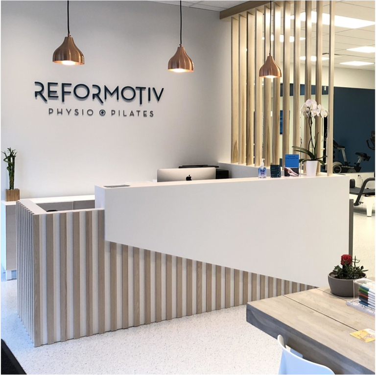


background
Everything about this brand was inspired by Reformotiv’s tagline, A Movement Lifestyle. The logo design feels fluid, elegant, and graceful. The extended, open letterforms represent lengthening and mobility which are key pillars of pilates and physiotherapy. Sharp, precise angles were also used to mimic the shapes of the body while performing intentional movements.
We coupled the logo with a monogram that incorporates all of the important elements of the logo in a paired down way—perfect for the website navigation and social media profile images. We also created a chevron-based pattern that mirrors the angles and forward-momentum featured in the logo.
Carrie and Larissa had their hearts set on inchyra blue as a core brand colour, so we built a monochromatic palette that would support and complement the bold hue.
To really drive home the movement of this brand, we designed and developed an easy-to-navigate website featuring an animated logo reveal in the hero. From there, the site features movement-focused photography and strategic content blocking so it’s easy to skim, browse services, and book appointments.